

Biffa
A fresh brand for Biffa
Biffa is the UK’s leading integrated waste management company, offering waste reduction, collection, recycling, recovery and disposal.
 01
01
Challenge and opportunity
When Biffa approached us, its business had evolved to encompass an integrated offer with sustainability at the heart of its strategy. To propel Biffa towards future success, it became evident that its brand identity also needed to evolve to reflect the organisation as it stands today.
The challenge involved building on its purpose, vision and values to create a cohesive brand narrative that set the foundation for all its communications. The visual identity also needed a refresh while maintaining the powerful equity of Biffa’s name and its recognisable primary red.


What was the solution?
We began with a discovery phase, via a series of interviews and workshops to provide greater clarity on what Biffa stands for and what makes it stand out. Biffa has a wide range of operations, ranging from state-of-the-art polymer recycling to food surplus redistribution. We developed a new brand idea which encompassed all the company’s services and values: to change waste for the better.
Our insights revealed that Biffa’s personality is its secret weapon. Many of the stakeholders interviewed, both internal and external, commented that their interactions with Biffa were refreshing and enjoyable. This aspect of the brand was much loved and therefore vital to preserve. We encapsulated this personality in four key traits: down to earth, caring, practical, and switched on.


Creative development
Creatively, it was essential to preserve the Biffa red – which is not only iconic, but also physically present on thousands of bins, trucks and other collateral across the country.
To complement this red, we developed a fresh new secondary colour palette which suited a modern, forward-thinking brand and provided Biffa with more flexibility when creating brand communications. The new colour scheme introduced a range of calm greens, showcasing Biffa’s sustainability efforts without relying on the typical ‘sustainability green’ shade so prevalent in the industry.


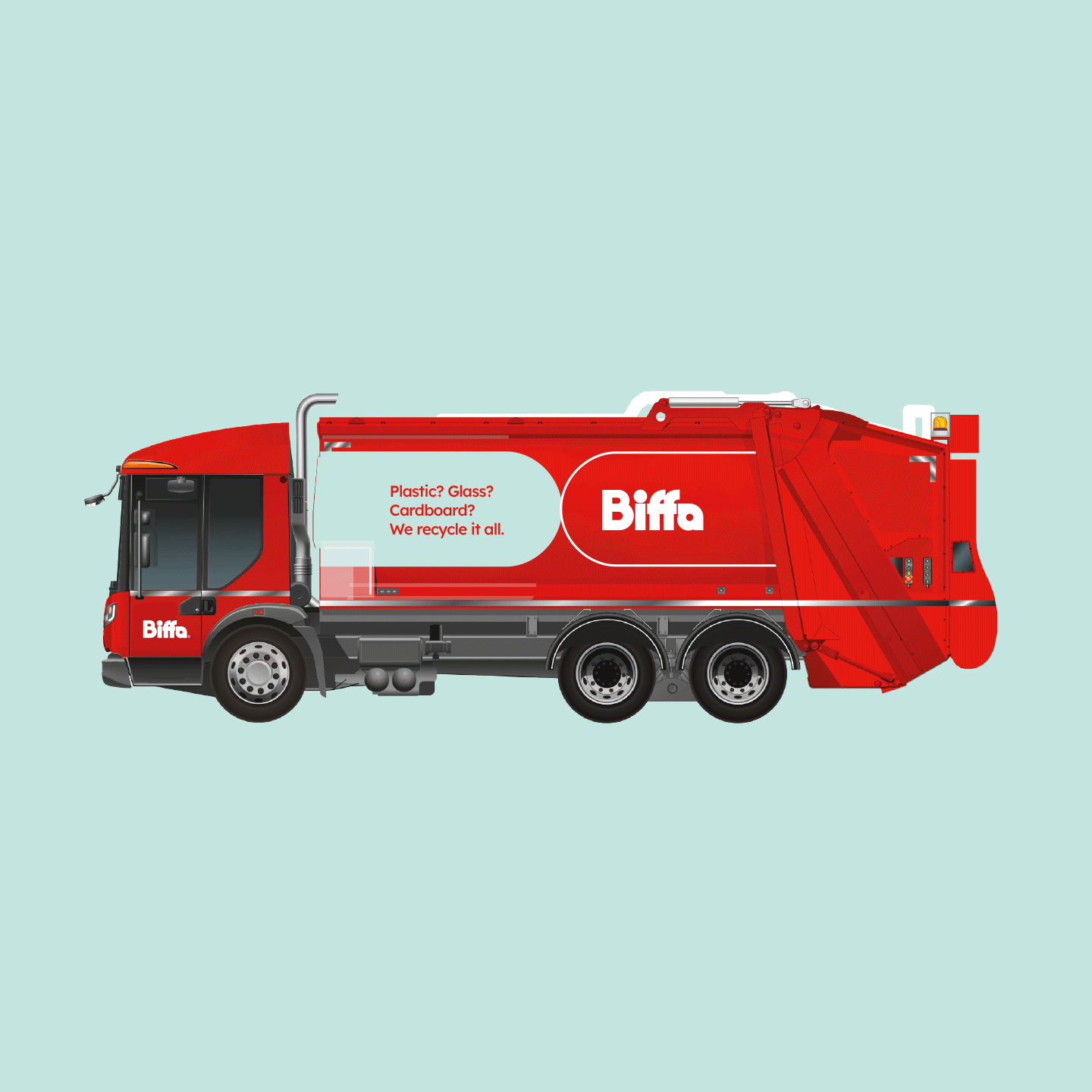


We developed a new brand graphic system, with a dynamic and creative set of brand shapes derived from the instantly recognisable logo. This system foregrounds the counter shapes within the logo, representing the untapped potential that Biffa turns into value. We also produced guidelines for a primary and secondary photography style.
The combination of curved shapes and a mellower colour scheme was an intentional move to combat the perceived masculinity of the old brand. Biffa is making great strides towards improved diversity in the industry and the new brand reflects and empowers that movement.


