Informa
Rebranding a FTSE 100 giant
With the acquisition of UBM having such a large influence over the scale and structure of the enlarged FTSE 100 group, Informa asked Luminous to review its brand and change the way it presented itself to the world.
 01
01
The brief involved developing a new brand platform to unite a diverse international team, establishing a coherent brand architecture that made sense of the enlarged organisation, articulating a clear customer offer and creating a fresh digital-first visual experience that captured the dynamic spirit of the business. The challenge involved reviewing everything across the brand spectrum apart from the logotype, which carried legacy equity.
 01
01
Working with a culture insight partner we undertook a two-month discovery and assessment stage to help us understand the cultural landscapes before the acquisition and highlight existing perceived differences between Informa and UBM colleagues. The assessment integrated findings from three key sources: stakeholder interviews with 40 executives and senior managers; 14 focus groups, segregated by company, with around 150 anonymous participants; and an intranet survey, where 1,876 colleagues gave quantitative and open-ended feedback. The culture assessment revealed ten imperatives and four priorities against which Informa needed to establish clarity and achieve alignment throughout the organisation. These objectives provided the fuel needed to drive fresh thinking around the new corporate purpose, positioning and values.
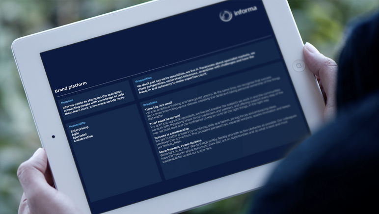
Based on the findings of the cultural insight survey, we evolved a fresh brand purpose and proposition that Informa could credibly own. A new purpose, ‘Championing the specialist’, captured what made UBM and Informa unique as organisations. It was a ‘big idea’ that would resonate with all employees and help align the group under a clear proposition.
With Informa and UBM having existing guiding principles and commitments, developing a fresh set of values for the combined business was key to the cultural alignment challenge. Through a series of workshops and interviews we created a set of four new values (entitled guiding principles) which highlighted a collaborative and united mindset.
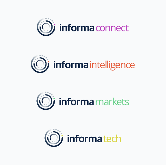
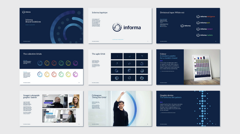
Post acquisition, the group structure had become increasingly complex, with five divisions and a ‘bolt-on’ UBM. Some of the divisional titles carried the Informa name while others went to market as independent brands. To bring the Informa name to the fore, and embed UBM into the Informa structure, we developed a ‘branded house’ approach, establishing a new divisional structure of Informa Markets, Informa Intelligence, Informa Tech and Informa Connect. This approach helped create a sense of unity across the enlarged organisation.
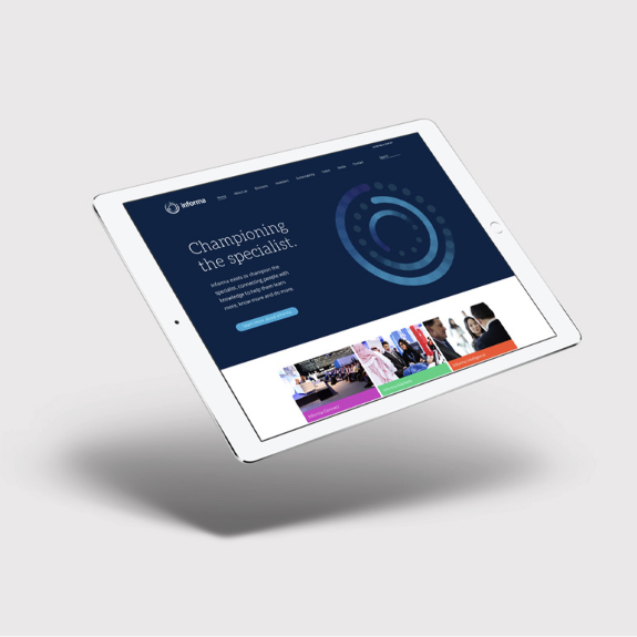
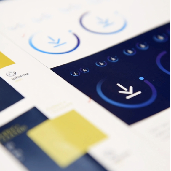
We used animation and movement to develop an agile and interactive visual experience, creating something that people could engage with across a range of digital applications. The core ethos of our approach was to develop an identity that could constantly evolve. It’s a brand that doesn’t stand still, with the agility to go forward as the company progresses.
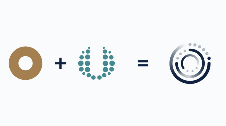
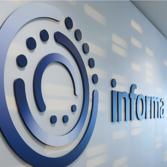
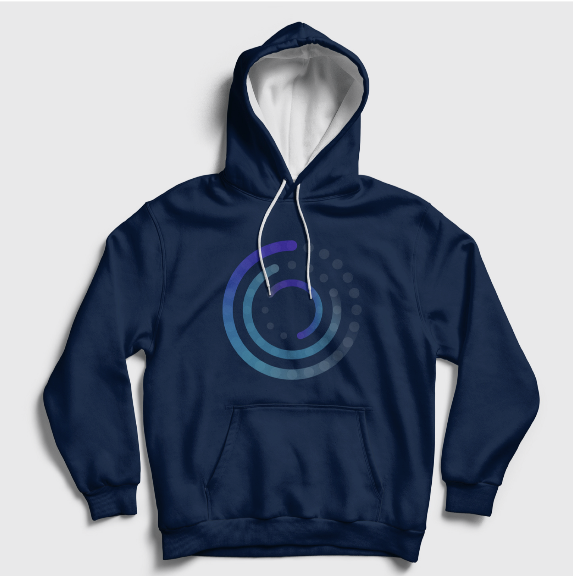
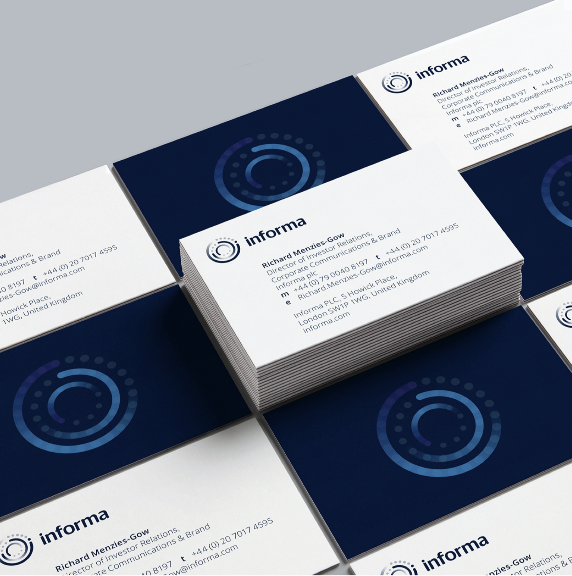
We developed a new graphic identifier, which we called the ‘Orbit’, which, when aligned with the legacy logotype, created an identity that reflected Informa’s strength of history and embraced its future opportunity as a dynamic and innovative business.
 01
01
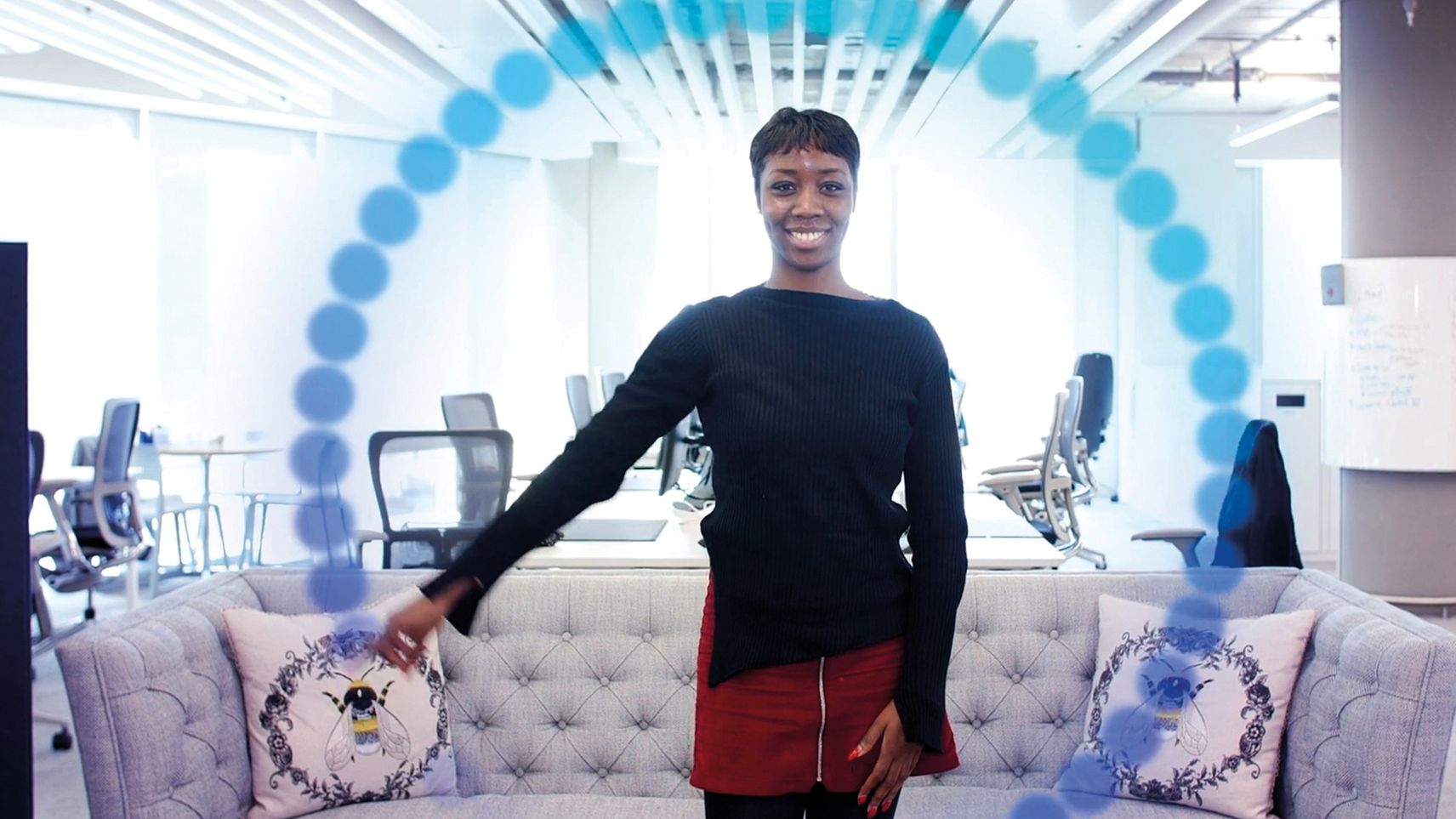
With well over 100 pieces of collateral to develop, the strength of the creative idea lay in the agility of the Orbit device to be flexed in varying ways across different forms of brand communications. In moving image, the animated Orbit device was used as a dynamic graphic that colleagues could interact with.
 01
01
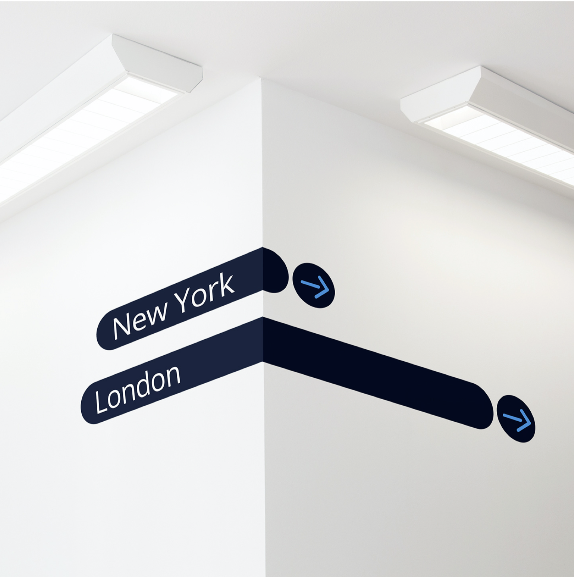
The curves and dots that make up the ident were utilised as individual elements to hold imagery in marketing collateral and were used distinctively across office signage and merchandise. The individual graphic elements were repurposed as a grid system that was adopted for signage, carpet patterns and meeting-room manifestations as the brand was applied within office interiors worldwide.
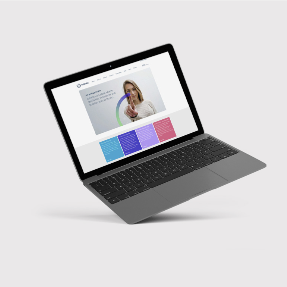
Evolving the brand into a digital-first experience meant utilising a fresh set of open typefaces, which would be easily available for colleagues around the world to use consistently across all channels without compromising to ‘default’ typefaces. The two type families we chose, Aleo and Open Sans, work particularly well on screens as they are designed to be legible when used in small sizes such as on mobile devices. The typeface choice enabled us to bridge the gap between all of the typical Microsoft applications and printed collateral, so the entire suite of collateral presents a joined-up visual experience.
A fresh colour palette was developed to promote the strength of the branded house group structure, with two legacy blues positioned as the primary colours across both group and divisions. This carried over a sense of equity of the existing Informa brand. A suite of vibrant accent colours was added to ‘code’ each division. The colour combination was a more forward-thinking system when working cross-channel on screen and in print.
Awards
Best Corporate Rebrand following a Merger or Acquisition, Transform Awards

