CDC
United through brand
With both equity management and social purpose sides to the organisation, CDC, the UK’s development finance institution, had always suffered from a split personality.
While the fund managers’ clear purpose is to ensure ROI, the community project teams in Africa and Asia have more altruistic objectives. This paradox had resulted in a generic visual identity with little to distinguish it from sector peers. With management having different narratives depending on the audience, the need for alignment around a singular purpose and ownable brand identity was pressing.
To help drive alignment around a common purpose, our discovery process involved engagement with leadership, marketing and equity teams through workshops and interviews. The sessions highlighted that unity could be generated by viewing the meaning of profit in broader terms, rather than purely financial connotations. Everything CDC did was ultimately about profiting in some way – whether it be financial, personal or societal. With the discovery stage providing agreement around a brand platform underpinned by a common narrative and shared vision, the key challenge was how to bring this new alignment of finance and social purpose to life.
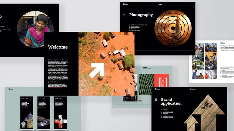
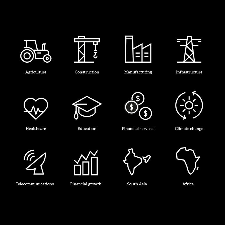
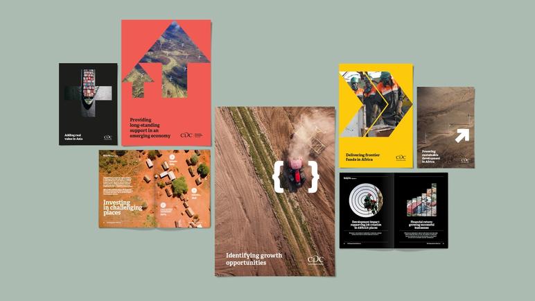
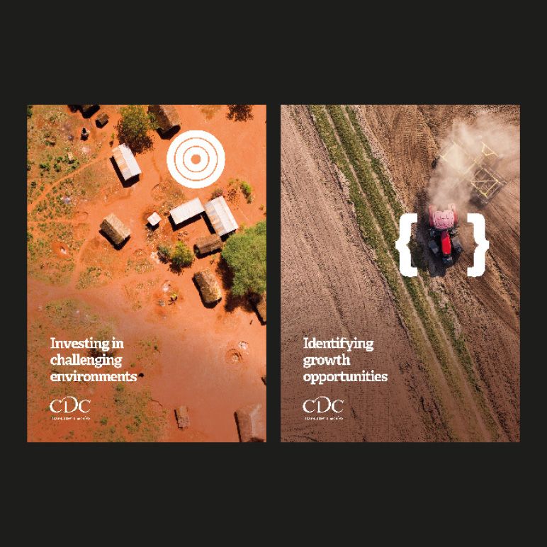
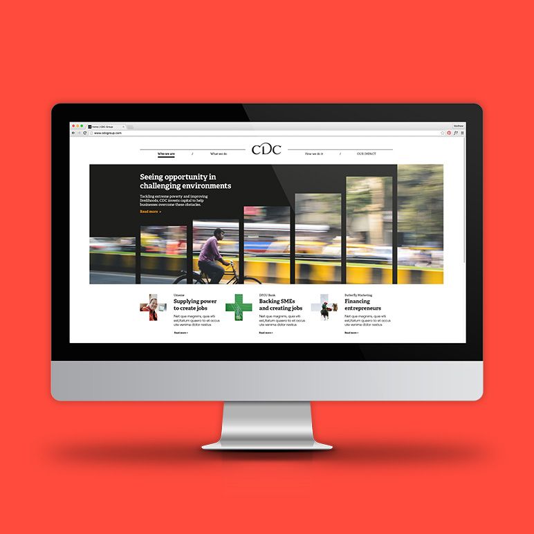
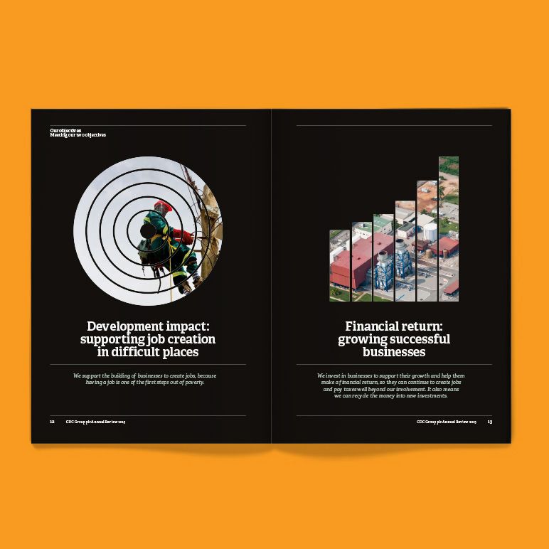
From a creative perspective, to drive advocacy from all sides of the organisation, the solution lay in combining the visual iconography of finance with imagery of ‘on the ground’ projects. Used together with photography, the conceptual graphics and keyboard symbols provided a frame to help tell a balanced story about how CDC delivers both development impact and financial return. This intersection of graphics and imagery created a highly distinctive identity, which had the flexibility to work strongly across all print and digital marketing collateral.
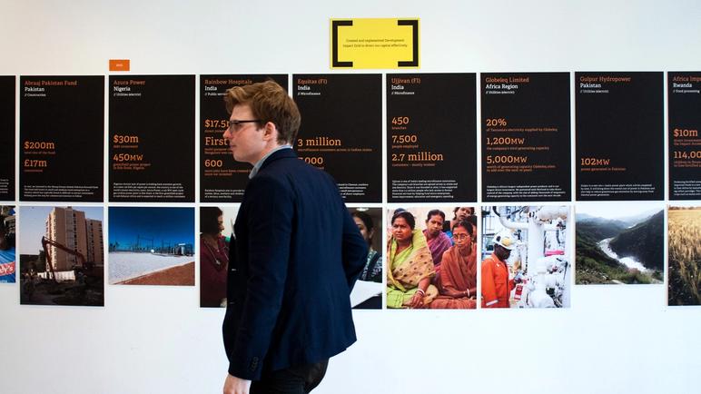
Impactful imagery helped bring to life the development aspect of CDC’s work. Aerial photographs demonstrated the scale of CDC’s development impact in countries, sectors and wider communities. Use of real environments captured the reality of the diverse and challenging locations in which it operated, while the depiction of real people showed CDC’s impact on an individual level, capturing those who benefit directly from its investments.
Having established a brand that is instantly recognisable as CDC to external audiences, ongoing development has focused on evolving the visual style for use across areas such as internal engagement and alumni communications.
The graphic style was repurposed for an #AtOurBest campaign brand that aimed to increase awareness and drive engagement of CDC’s values. The campaign celebrated the diverse moments, the big and small occasions, and the stories of what CDC is when it is at its best.
We also named and branded a new CDC alumni network, Connected. We transformed the graphic elements into ripple effect patterns, which evoked the impact of CDC across communities and societies. The logotype was inspired by the main CDC logo, using typographic ligatures to link characters in a simple word-only mark, which evokes heritage and connectedness.
